Nothing spoils a plot like (too much) data.
The bottleneck when visualizing large datasets is the number of pixels on a screen.
— Hadley Wickham
Massive numbers of symbols on the page can easily result in an uninterpretable mess.
— David Smith
Managing information density is critical for effective visualizations. Good graphics let us understand global shape as well as finer details like outliers. We need a dynamic range in visualization, much like in photography with HDR.
 Tel Aviv port, illuminated with HDR
.jpg)
It’s clear scatterplots don’t scale. But while overplotting is unavoidable well before big data, it is possible to mitigate it and limit symbol saturation.
Above all show the data! Let’s see how.
Limiting data-ink
Sampling is a great solution if you just want a broad undertanding of your data. You may miss outliers, but if you are good with it, and take care to properly randomize, go for it.
Filtering by default can give the user control over the graphic, and prevent overplotting from the start. Just show less data! In many cases, you’ll have time-dependant data: select by default the smallest range that makes sense, and give to brave users an option to add more information.
Using smaller points are an easy fix. Just plot much less! If you use pixel-sized symbols, computing the plot will often be much faster.
Empty markers, like circles instead of discs, will give some air to you visualization while keeping individual observations readable. It’s a solid choice (hahaha!), and R’s default graphics opted for this option.
Using empty markers is a #solid choice for scatterplots ⭕️😉 https://t.co/FXW4TqSQgL #overplotting #dataviz #datascience #bigdata
— Shape Science (@shape_science) November 15th, 2016
My experience has been that those ink-wise techniques work well… until someone sends you a bigger dataset…
Moving the data around
The order in which you plot points is important. Overplotting will hide the points at the bottom, so consider removing bias by randomizing your points' ordering.
Facetting will split your observation into multiple plots and often save your sanity trying to understand how different groups blend.
Jitter can help if your data points are crowded around thresholds or if they are censored. You data is often less continious than you’d like. Adding jitter will also do wonders when you have ordered categorical variables.
Fading individual observations
 Alpha-blending means adding some transparency (alpha) to your datapoints' fill color. As they pile up, you’ll get a density plot for free. If using empty symbols is not enough, do this. There are some pitfalls:
- Outliers become hard to see.
- For R users,
ggplot2is not smart enough to show the opaque color in your legend. You will wonder how to fix it every time!
Color scales and alpha-blending don’t mix easily
It is very possible your points are colored according to an other variable. As points stack on top of each other, you want to retail legibility. Unfortunately color are a difficult topic.
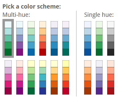
The basics are that for categorical scales you want perceptually distinct colors, and for quantitative scales you want perceptually regular and smooth color transitions. Getting it wrong is easy: it’s often best to default to ColorBrewer or viridis (read more):

Quantitative variables and alpha-blending
With a color range with varying luminance and saturation (but not hue) – as often recommended – superposing points will appear darker and more saturated than they are. This makes you misinterpret the data! I would advise to use multi-hue color scales.
An other sad problem is that the resulting transparency when stacking N points is exponentially decreasing.
It’s flat for most of the regime, and then spikes in a relatively short scale. The spike is where we get color differentiation (different opacities get different colors). That’s bad: color differentiation should be uniform across the scale. – Carlos Scheidegger, @scheidegger
Categorical variables and alpha-blending
- You may want to add a 2d density contour layer for extra legibility.
- Blending colors is difficult, especially if you care about perception. Make sure your scatterplots' colors are not artefacts resulting from the blending process. Be extra careful here.
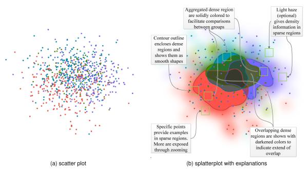
- For some inspiration, read about “splatterplots”:
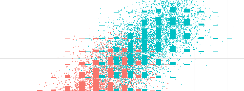
Still too much overplotting? Use binning
At some point, all those “big data” points draw a fine empirical 2d density estimator. So pick the right tools and use 2d density plots or binning-based tools.
More generally you can see the process as binning > aggregate > (smooth) > plot. Don’t be afraid, it’s not far from ggplot2’s logic. Here are some examples:
| Aggregating by | gives you |
|---|---|
| count | density histograms |
| count > 0? | the data’s support |
| median value | bins' common values |
| distribution | bins' distribution |
| distribution (cat.) | blending |
Doing binning right is harder than it looks1. Find libraries that do the work for you…2, and read good explanations in bigvis’s paper, or in this presentation by Trifacta.
Final tip
If all fails, show density marginals. In fact, do it even if you don’t have overplotting issues!
Should you pick hexagonal or rectangular bin shapes? How do you choose the bin size / banwidth? How do we choose robust summary / aggregation statistics? How much smoothing should you apply along bins, if any? Doing this fast requires solid engineering… ↩︎
imMens was inpiring some years ago. I’m out of data really… ↩︎